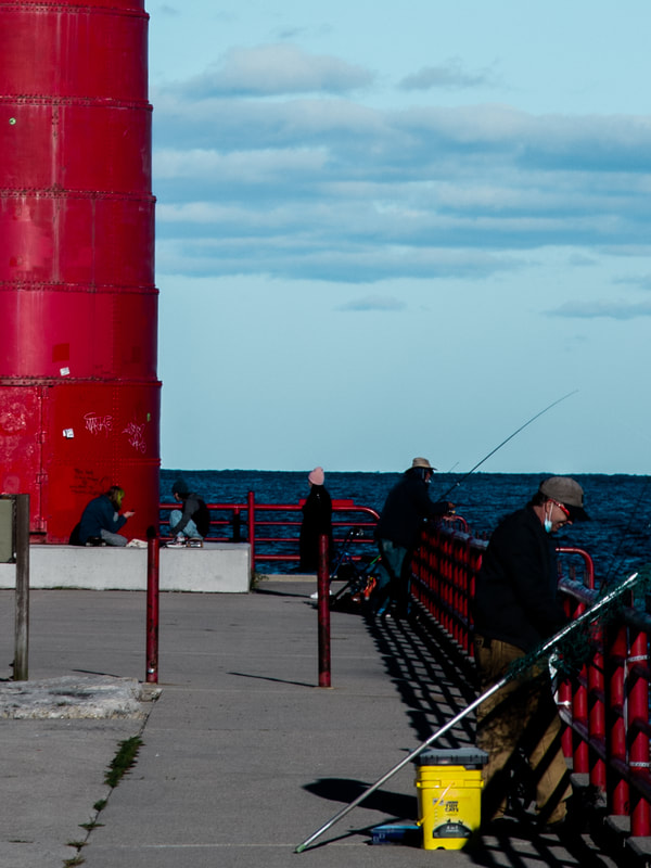
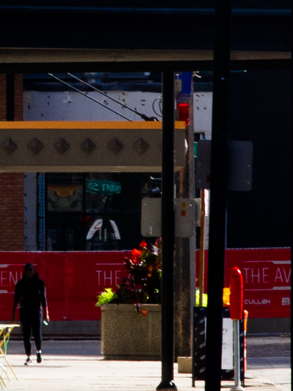
Lens-Based Photo ProjectProcubus 20.32cm x 25.4cm Pentax K5 with 70mm zoom 09/18/2020 Exhibition Text: This particular photo stood out amongst the following series because of its stark contrast, and the interesting use of symmetrical framing, which is why it connects so well to my artist of inspiration, Saul Leiter. This piece uses temperature, lighting, and color to create a rather blue mood while freezing a centered silhouette in the sky.
|

|
Artist Inspiration

|
A Short Introduction "Saul Leiter was a New York-based photographer and painter from the age of 23 to when he died in 2013. After studying to become a rabbi, he left his hometown in PA to become an artist in NYC. He was first inspired to paint by abstract expressionist works from Richard Pousette-Dart's discography, and he later started dabbling in photography after being convinced by Pousette-Dart and W. Eugene Smith. He began gaining traction through photography with his unique use of color, which led to a string of exhibitions showing his work at a variety of well known modern art museums (including Milwaukee later in 2006). He was very active with his photography career from the late 50s through the 70s and 80s with many works being produced for fashion magazines. A lot of his lesser-known work used contrasting colors in urban settings. His later paintings were often very similar to his photographs with color and contrast being the center-piece. Leiter's works are now studied and celebrated from the Art Institute of Chicago to other colleges and museums all over Europe." |
Critical Investigation
|
In most of Leiter's work, the shutter speed is relatively high, which is apparent because of his ability to stop time with his photography. One of his attractions as an artist is how all of his urban photos manage to show the bustling New York life with color, depth, and mood. In Reflection (1958), There's an intense level of layering that is emphasized with the the lower aperture, forcing a strong illusion of depth. The first layer is the man in the bottom right corner, but he is out of focus, so our attention is not meant to be on him. The next layer is one of the items that has the most vibrant color, an awning just above the aforementioned man. Though it is a darker shade of red and has very little exposure to light, it provides a sort of partial border or vignette for the photo. The next layer is in focus, and uses something that shows up in a majority of Leiter's work: reflection. In this case, it is in a mirror with our main subject in clear focus. He is dim lit, with a lot of orange light surrounding him in his layer. The final layer is a separate reflection to the left, and is lit by more white light, emphasizing the better example of the red that was seen earlier. With all these layers, on paper it may sound like this is a photo that is saturated with too much subject matter, but it actually perfectly showcases the beauty of Leiter's intentions. He oftentimes tries to frame a subject by playing with perspective very creatively, while still highlighting the beauty of how vibrancy can be found anywhere. This particular photo does this rather well, with lighting and a seemingly natural sort of color filtering being effectively uses to create layering and depth.
|
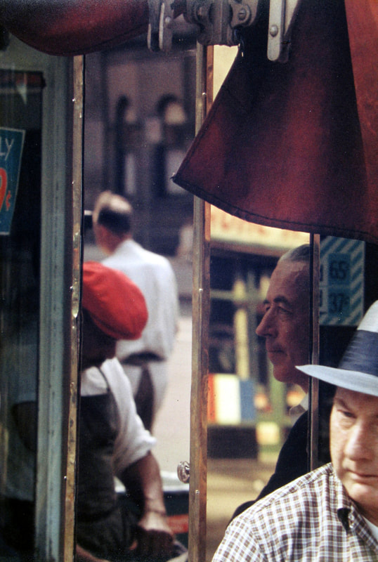
Reflection (Leiter, 1958)
|
Mondrian Worker (Leiter, 1954)
|
In Mondrian Worker by Leiter, he shows off his use of contrast rather well. The blacks are relatively prominent, making the shadows apparent. What is often overlooked is the geometry this can create in his work. There are areas in which there's high contrast due to the brightness of the whites and darkness of the blacks, but these areas form different shapes that can add an element of shape and form to his work. Something that can also be picked up from this piece is the framing of the shot. The doorway that the subject is in is a very interesting natural framing, but Leiter decided that this was going to be off center in order to capture of the shapes of the wood boarding on the walls surrounding the doorway. The ladder coming in from the side also adds another fascinating point of geometry. While color seems to be secondary in this particular piece, it is still prevalent. The spots of teal on the walls even add to the aforementioned geometrical structure of the photo. The bright blue and highly exposed denim overalls make the subject of the photo stand out, thought the darkness in the creases of his clothing are the true reason that he contrasts, especially among the darkness of the room in front of him. This photo goes to show that while much of Leiter's work is influenced by color, especially in the years following the taking of this photo, he will oftentimes put color on the back burner for the sake of getting a something well framed and capturing contrast.
|

Planning
|
As soon as I was given directions for the assignment, I took off with my planning notes. The first thing I worked on was my ideas for composition. This portion of my notes was crucial for setting up how I would take photos with knowledge of technical abilities (which I had yet to pick up at the time). This section reads:
" PLANS FOR COMPOSITION - I would like to use complementary colors in creative ways, and they should often showcase some kind of blend of perspective. Sometimes the format may be to have a vibrant color amongst a rather drop background. - The colors don't always have a lot of vibrance. They just usually stand out in some way. Sometimes its two colors, sometimes there's just some fancy play on perspective, like a shot of a reflection in a window. " Below this, I have a short list of locations that could house some good shots. This list would eventually expand as I explored the city. |

|
Sketches

|
My three planning sketches cover each of the elements I would like to capture in my photography. The first of them is very similar to Modrian Worker by Leiter, which was previously discussed. It carries the theme of the construction worker being the subject, and capturing a scene that housed several different forms of geometry, making for an interesting framing. There is also some stark contrast with a dark black in the doorway. The next sketch was more about going for scale than anything else; an interesting use of perspective. This was more of a cinematography inspired sketch, going for something like a Vince Gilligan or Noah Baumbach shot, both of them being known wide shots that convey immense scale. This ties to Leiter's work as well, when he rarely showed a scene from further back. My final sketch was looking more closely at Leiter's most often used trick of capturing a subject through a window, which in turn would often manage to get himself in the shot via a reflection.

|
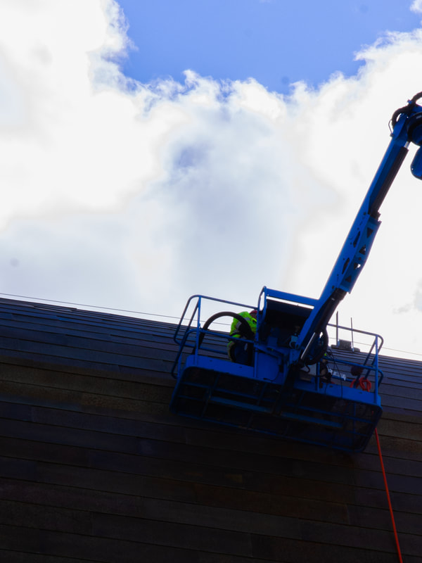
Equipment + Preparation Before I took any photos, I consulted my stepdad, Kenneth Kornacki (pictured). He has been a photographer for about 9 years and had much to offer for me, both in words of advice, and in equipment. He was kind enough to give me his Pentax K-5 digital camera with a 17-70mm zoom lens. The camera has plenty of room for controlling aperture, shutter speed, and ISO, along with a pretty accurate auto-focus feature. Ken showed me the ropes of the technical stuff, which I also planned on using after the project since I've had an interest in taking up photography even before the project. I also decided that everything would be shot with manual settings so that the raw photos would be as close to my vision as possible. None of the shots used any automatic settings, other than auto-focus. With that, I was on my way.
|

To see more of Ken Kornacki's work,
find his Instagram: @kenkofoto |
Process

|
I already ride my bike around the city at least 15 miles per day, so all I had to do was bring my camera along with me to get some Leiter-like photos around town. Over the course of about a week and a half, I stopped to get every shot I possibly could as I biked along the Oak Leaf trail, as well as around Bay View, Walker's Point, Downtown, the Third Ward, Story Hill, and the East Side. I racked up 140 miles in this time because of all the photo hunting. |
The Series (with critiques)
The following images are, from right to left in each row, in the chronological order in which they were taken (by day) to show the progression of both raw technical skill out in the field, along with editing abilities. There were many photos left out, and there were many different versions of each photo you see; these are the best ones. All photos are cropped at 4 x 3, meaning they print at 10" x 8".
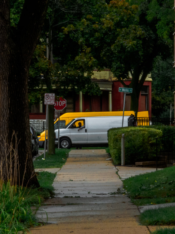
On Target. 9/12/2020.
|
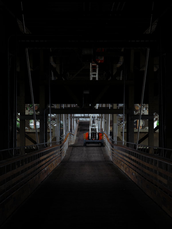
Lift. 9/12/2020.
|
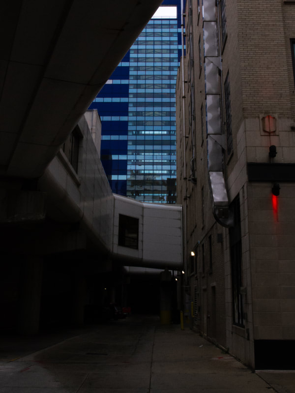
On the black screen. 9/13/2020.
|
My first handful of photos had much less of a focus on people, and more of a focus on choosing inanimate subjects or scene that would make for some good contrast. The first photo show, On Target, was taken because of it's interesting framing, with two vans of different sizes perfectly centered, with a path leading directly to them. This is an example of going for something with more natural framing, and makes for good use of having a centered subject. The second of the photos, Lift, shows a centered path, but an off center subject, one who's color stands out amongst the dark blacks that surround it. This one, along with the third photo, were both chosen for their potential for contrast, especially On the black screen with its angular geometry that shapes the opening that reveals the striking blue of the building in the background.
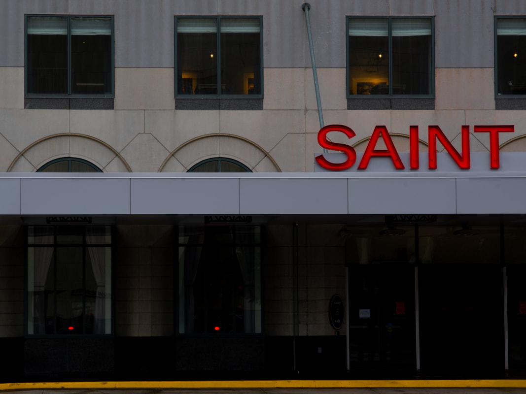
Kate. 9/13/2020.
|
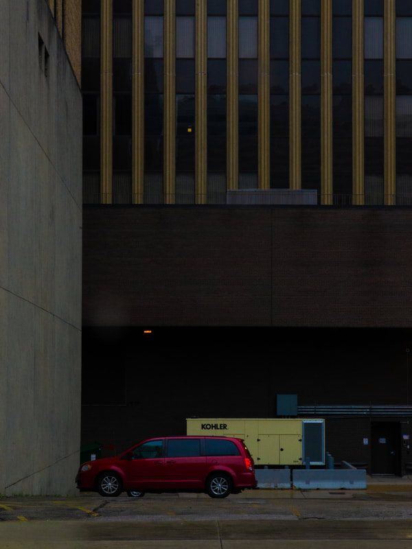
Rest. 9/14/2020.
|
Kate and Rest are both great examples of having chosen a shot purely because of its color. In these two, the red stood out. The main differences are in how they were framed and cropped. In Kate, the yellow curb on the bottom made for an interesting lower frame because of how it lines up parallel with the overhang above it. In Rest, the red panels seemed to work best centered on either side. While Leiter's work is almost never symmetrical, this shot seemed like it could make fascinating work of having a centered subject.
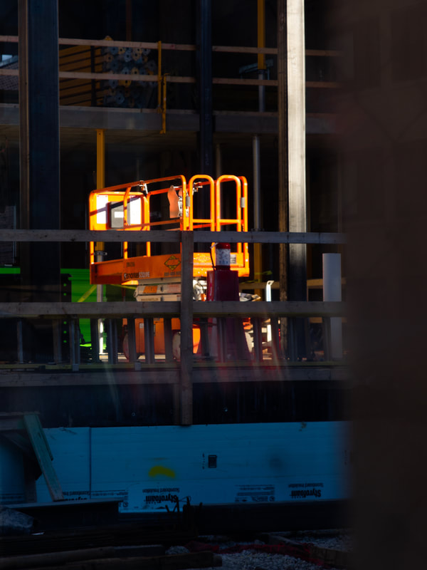
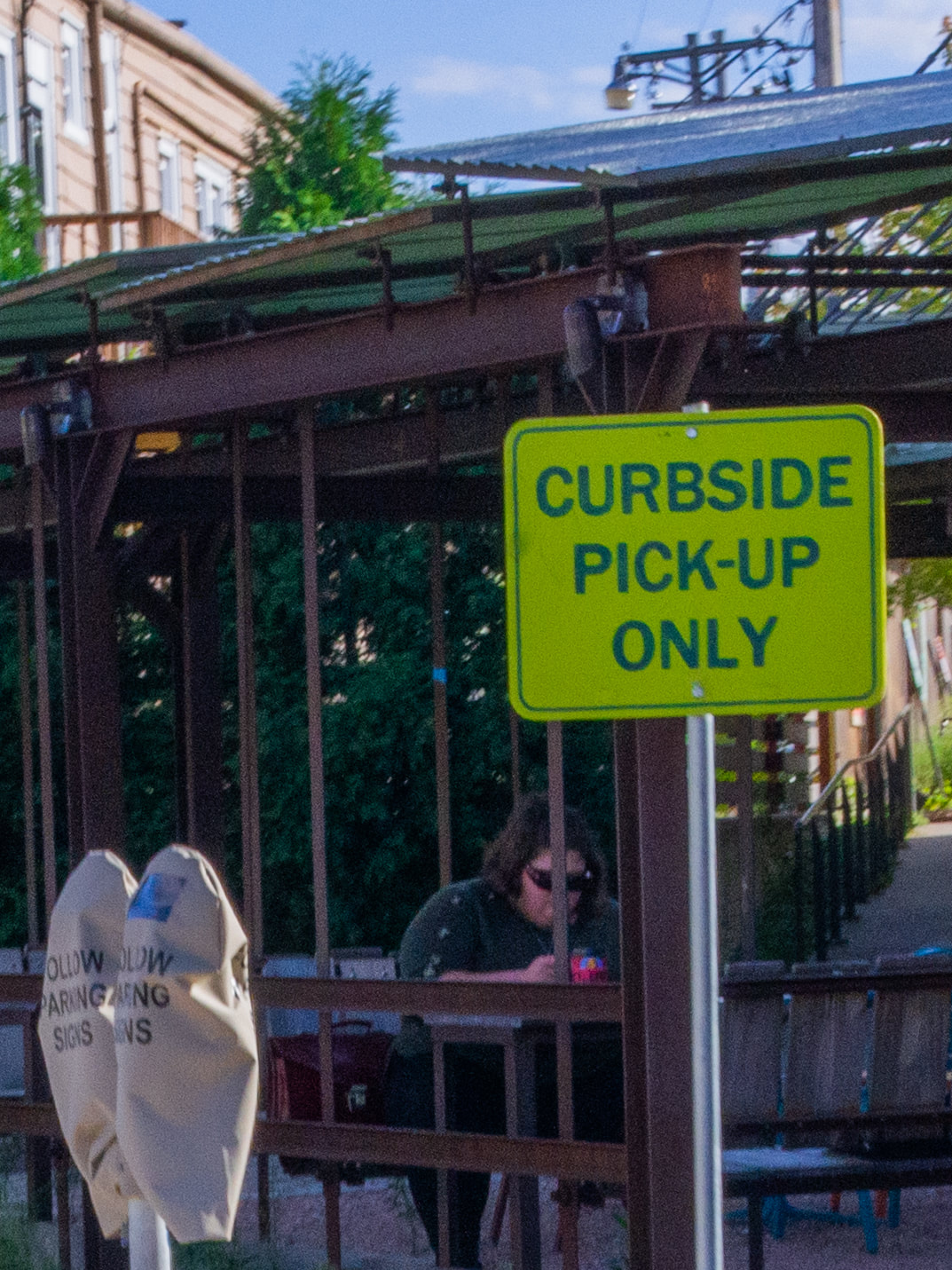
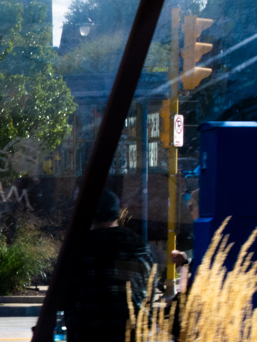
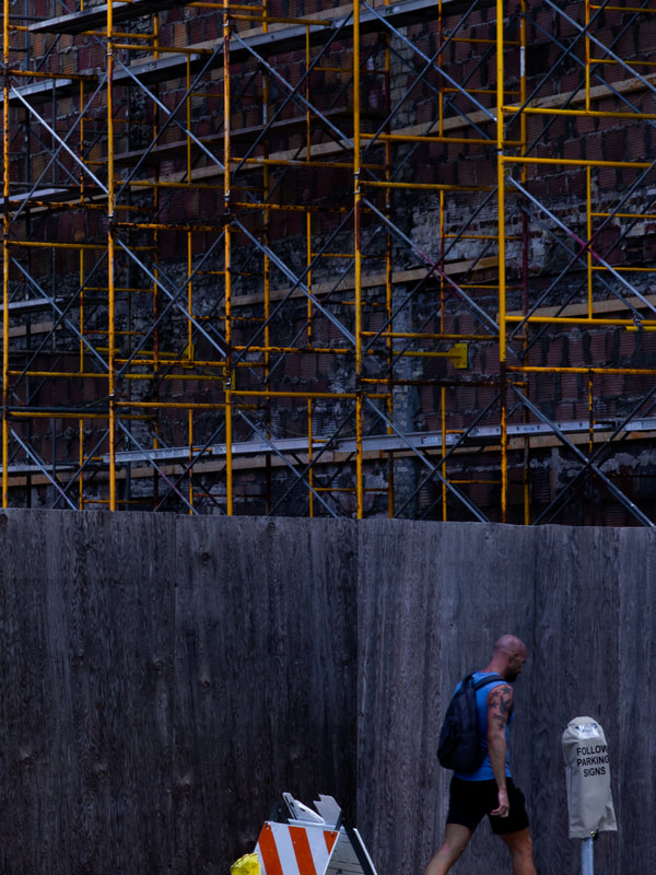
Wage Slave. 9/15/2020.
|
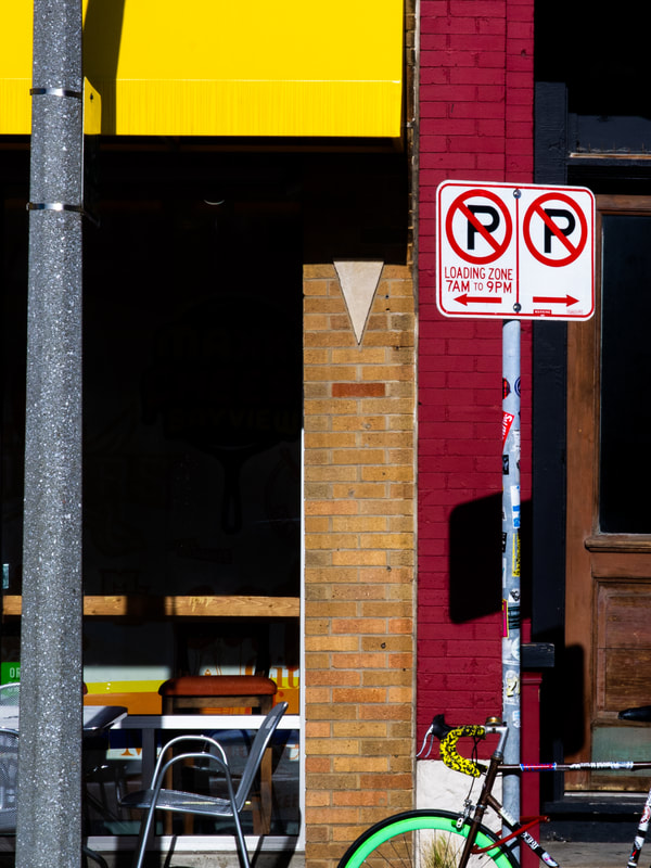
Barred. 9/17/2020
|

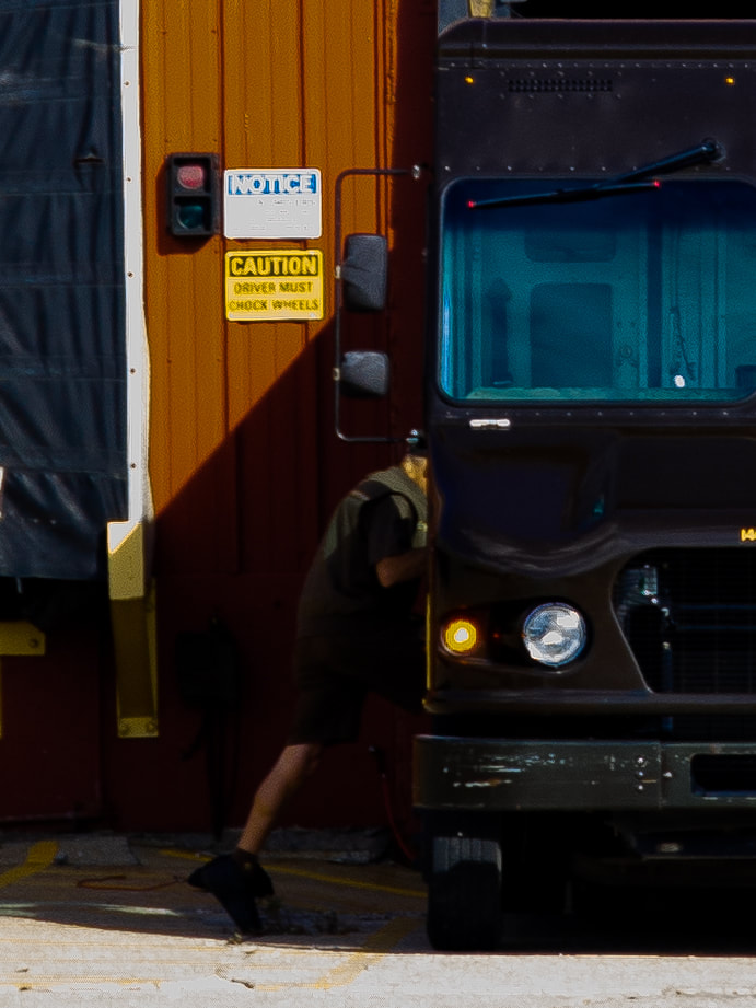
bmx. 9/17/2020
|
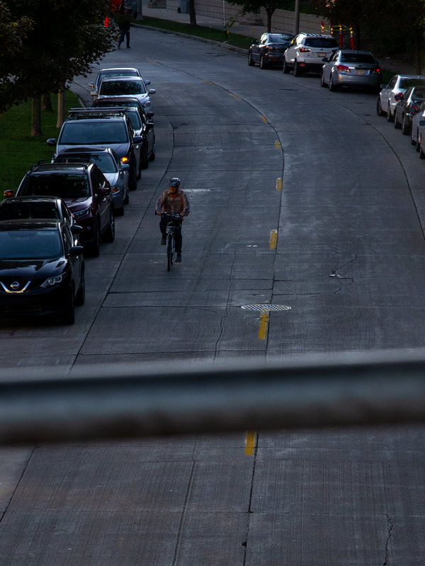
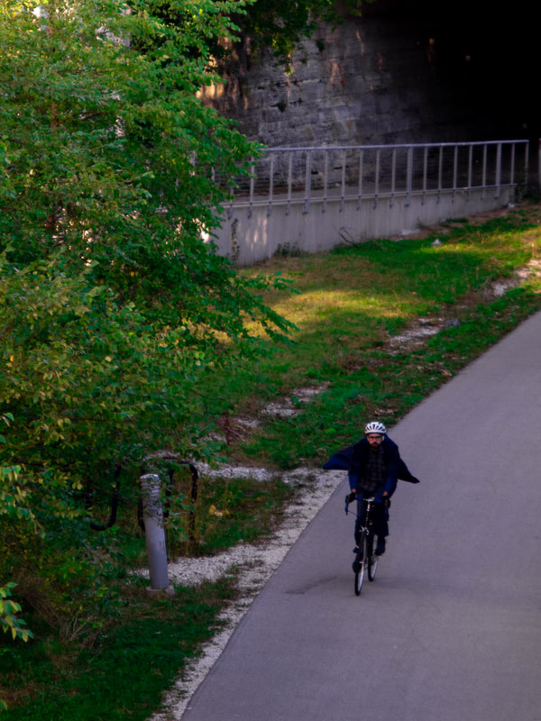
The next few photos differ from the fist several in many different ways. In the first of these three, I went for scale and contrast. I kept the blacks low, so that the background allows the two bright yellows and reds stand out, and I brought up the blues to have some kind of melding of primary colors. I decided to keep it as such a wide shot in order to show perspective. This one was looked at from a bit of a cinematography perspective. The next two use different ways of perspective, with having a blurred, yet sort of important object in the foreground, and having the focus on people, getting closer to Leiter's style. Barred shows a dotted line of a dark yellow that pops amongst all the gray, and the off-center cyclist adds a touch of life. In bmx, the focus is again on contrast and lowering the shadows to give the silhouette effect, this time to a whole group of people.
Caped Cycle Crusader? 9/17/2020
|
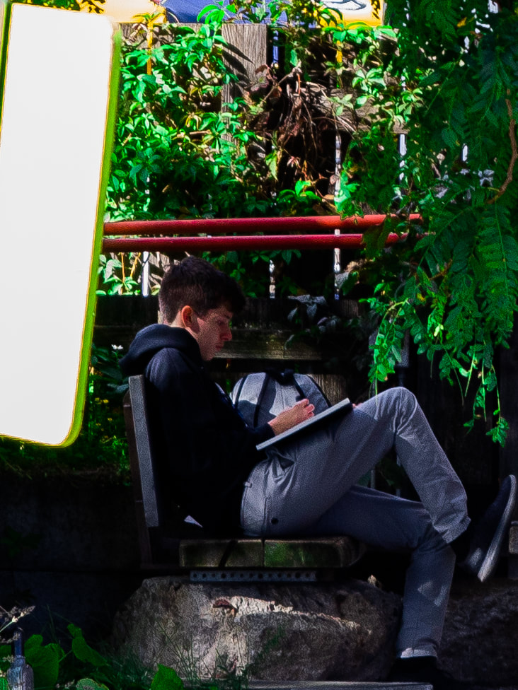
personless. 9/17/2020.
|
Clownin'. 9/17/2020.
|
The next three seem to be consistently Leiter-like, especially the first and third photos. The first features a subject shows shadow is almost gone in order to make his dark blue, flowy jacket convey more movement and pop, with the contrast of dark blacks coming in from the top right corner. Personless goes back to the focus on bright colors amongst drab grays, this time with a very Leiter-like technique of shooting through a window to capture an interesting reflection. In this reflection, the reds are blurred and make for an interesting distraction from the bright highlights within the orange. The blue strip below the fence acts as a contrast with the black since it is a complementary color with the orange. The third photo goes for something with more perspective again, as well as with one color standing out and a lower temperature to bring out some blues. The perspective shows up in the layering of the foreground, midground, subjects, and background.
WE. 9/17/2020.
|
Terry B. 9/17/2020
|
Muenster Mom. 9/18/2020
|
The next bunch all differ extensively from one another, but both WE and Muenster Mom feature a more film-centric look, even with a lower ISO setting. WE has a higher exposure and higher contrast, with whiter blues in the background, and darker shadows being cast in the foreground and midground. The contrast of the red against the blues makes for a vintage look, especially with everything being off-center to add the extra Leiter touch. Terry B again uses a blurry object to obstruct some bland background colors, and allows for focus on the cyclist, with their red shirt being the popping subject. The third photo is again a bit film-like, with bright, bright whites surrounding the dark blacks on the subject, which is often the opposite of what one would expect. This can be seen in some of Leiter's later work, allowing the brightness of a background to highlight a silhouette.
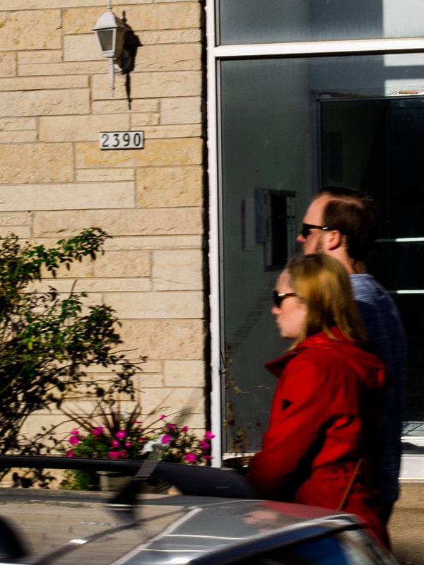
2390. 9/18/2020.
|
Parking pass. 9/18/2020
|
Lincoln Mania. 9/18/2020.
|
It's at this point in the series where I realize that Leiter's focus is most often on people, sometimes blending in, but often being the focus of his photos. In 2390, this technique is highlighted using movement and color. There's a balance of the two in order to not make the subjects too obstructed by blur, with vibrance of their orange-red skin and the deeper cherry red of the femme's jacket. The saturation of the pink flowers give another distraction, and the movement of the car below adds for some interesting obstruction and raw framing. Parking Pass is one that puts color in the foreground as the focus, and life in the background, out of focus. Lincoln Mania again uses movement, something Saul Leiter liked to often capture. Purposefully using a lower shutter speed while on the move was something that he would do while in the back of a taxi, and what made these photos worthwhile was their use of color.
Cosmo. 9/18/2020.
|
Truk. 9/18/2020.
|
Homework biome. 9/18/2020.
|
The next three choose an interesting point to center, still manage to play with asymmetricality. Cosmo has the strip of brown brick as the centerpiece, and having lost of rectangular geometry forming the strips of color that are all around. Truk shows a lot of contrast in the dark blacks like the previous photo, as well as some contrast in the framing. The photo is split directly in half by the left half of the truck and popping brown-orange wall in the background, and the shadow-obstructed subject in the center. Homework biome plays with having greenery surround a subject, with the very natural surroundings acting as a sort of juxtaposition against that of the writing student.

Banner. 9/19/2020.

construx. 9/19/2020.
|
Union Home. 9/19/2020.
|
The next three start to get consistent with color, subjects, and contrast. All three have a theme of construction that carries over, something that I learned that I liked while out in the city - also something that Leiter often liked to take photos of. In all three, there's bright pops of color, some kind of geometry holding the piece together, along with contrasting blacks in the foreground, midground, and background.
Belt and Road. 9/19/2020
|
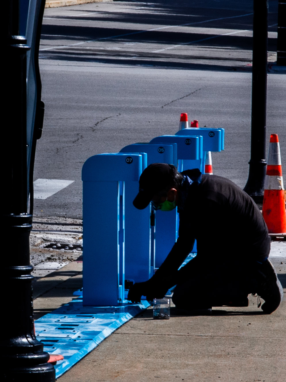
Bubble Maintenance. 9/19/2020.
|
A venue. 9/19/2020.
|
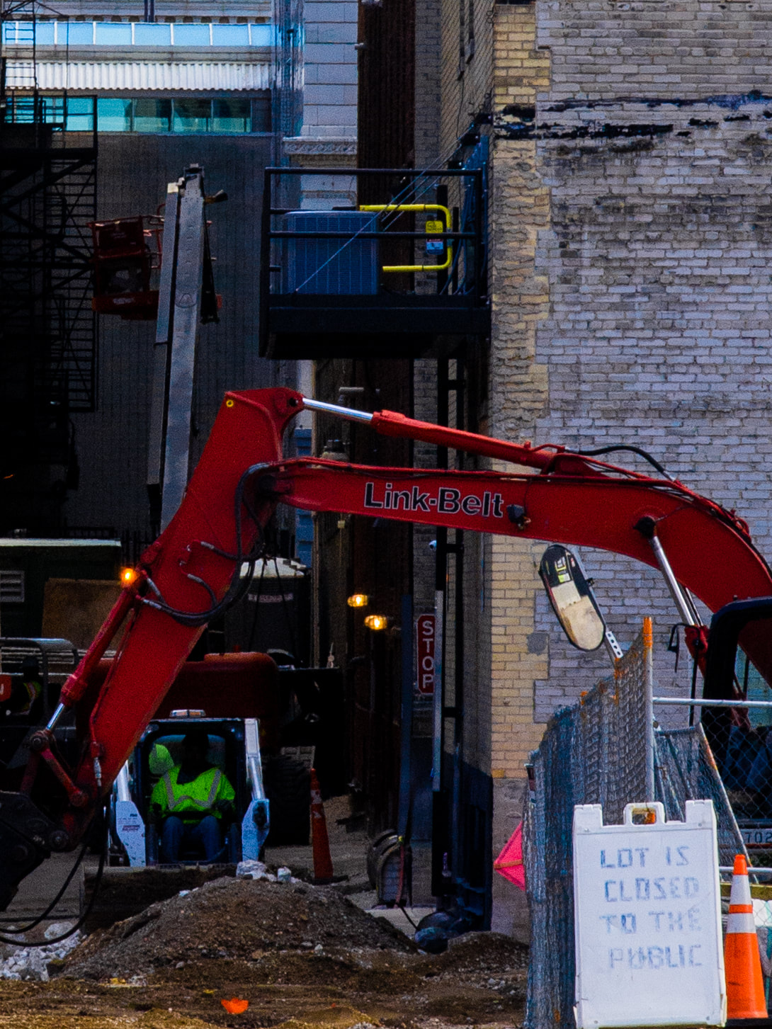
The cut back to the technique of having the subject be obstructed by shadow, while the color amongst their environment shines. Belt and Road has a fascinating framework of having the mechanical arm wrap around the man operating the other vehicle, and the bright red contrasts from the blue temperature that is protruding from further into the alley. Bubble Maintenance features more complementary colors, and while they both stand out from one another, they also pop with the dark blacks on the green masked subject. A venue is one that is taken from further back in order to highlight the rectangular framework and contrast in the yellow strip from the pure black overhang above it. The red lining in the background highlights the shadowed subject, as well.
Vertical. 9/19/2020.
|
Bus Stop Investigator. 9/20/2020.
|
Stripe(e). 9/20/2020.
|
These low-temperature photos seem to be all equally as Leiter-based. Vertical has complementary colors, one of them being bright, yet narrow and subtle, and has the blue of the platform bringing out the yellow vest on the subject, but contains much contrast with the bright white of the clouds above and the dark brown panels running down the bottom half of the photo. Bus Stop Investigator again uses the blurry foreground, but this time sneaking in some creative contrast work with the bright reflections on the car, and the deep blue of the man's sleeves blending with the lower temperature railing in the foreground. Strip(e) used my favorite Leiter technique of subtly including oneself in a reflection, yet having a separate subject as well. The orange of the bicycle grips in the reflection correlate with the strip of orange to the right of the window, and the layering of blues in the car windows add some needed complements.

Riverlaunch. 9/20/2020.

Layering. 9/20/2020.
|


|
The final four photos shown gather the best of the Leiter-like techniques that I learned. Riverlaunch is another wide shot that messes with scale, this time with more saturation, and Layering shows a lot of contrast with many different vibrant colors complementing one another. Carrot-top uses geometry and color on a smaller scale than I had done before, and Severed shows a dark empty mood while still having a higher temperature and colors that pop.
Experimentation

|

|
This comparison is between the raw shot of "Barred" and the final edited version. I used Adobe Lightroom to edit all the photos. In the raw, it was all about framing. I knew I wanted the blurry railing in the foreground to add some interesting separation between the subject and the lens. When editing, I brought the focus in much more, while still having the cyclist in the distance. I decided to lower the temperature in order to have some contrast when I brought up the vibrance of the yellow lines on the pavement. I brought up the contrast and lowered the blacks in order to make the cars pop, but have all of them blend in with one another, as well as to have the cyclist pop more with their orange flannel.

The raw version and and final version of "Bus Stop Investigator" shows just how much can be done in the editing process. In this particular photo, I didn't know what my vision was. All I knew was I wanted the railing in the foreground, and I wanted the reflections on the red car to stand out. I ended up lowering the temperature and bringing out the blues that arrived from that process, and I cropped it much closer to the car to get those reflections, and managed to catch my equally as blue subject with it.
|

|

|

|
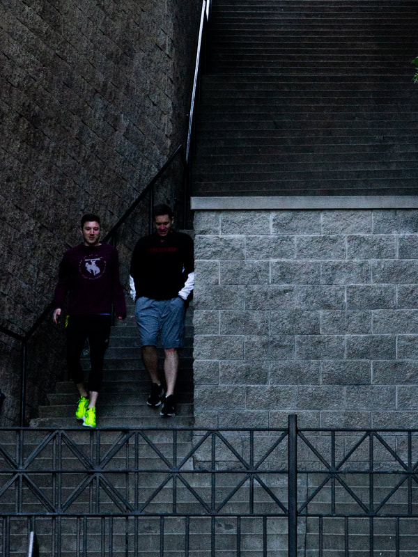
This is a comparison between two different versions of a shot. The final version of "Severed" (right) is not very highly edited at all, I only bumped up the contrast and made the orange cone a little more vibrant. On the left, it's a wider shot, with lots of people, which you'd think would be what I wanted to capture. And while this is originally true, what I wanted the most was contrast. This is a perfect example of there being many different shots within a shot. This one could have been done so much differently but could've held the same amount of contrast that I wanted. I ultimately decided to not have the focus on the people, but I easily could've had it vice-versa.
Reflection
Overall, I feel that throughout my process, I captured a lot of Saul Leiter's techniques pretty well. There were many that I kept going after over and over, like having a bright background with a silhouetted subject, or a dark background with lots of contrast, and a highlighted subject, often with some bright color that pops out. Even though the aperture is relatively low, and the shutter speed is high, there's still lots of movement in each photo, whether it's the motion blur of several people that I bike past, or the geometry that shapes the flow of the photo. Lots of the geometrical-centric photos feature dark blacks that add some contrast, most of which is angular; this is something Leiter often did, like in Mondrian Worker. While I would have liked to use Leiter's often-used reflection technique a little more often, it does show up several times in my series, with one of them including myself subtly in a window's reflection. This is something Leiter would often capture whenever he took a photo from somewhere like a diner window. The series accurately and rather obviously portrays my quick evolution in skill with taking raw photos, but there's still a lot of ambiguity in my vision for some shots, even as time goes on. This is one advantage I had over Leiter; the ability to crop, color correct, and sharpen my photos was a huge asset, but raw shots quickly became more important to me. They often seemed the most authentic, and it turned out to be very satisfying when there was a shot that didn't need to be highly edited to look decent.
Compare and Contrast
|
San Genaro. Leiter, 1958.

Similarities
- What I did explore in a lot of my work was dividing up the photography with geometry. Both of these photos use this technique, each having a rectangular strip dividing the photo in half. - Both of these feature similar colors in similar places. There's some red in the form of a long rectangle going down the middle. There's also some kind of bright yellow overhang that grabs your attention. - Both are going for similar themes with showing a restaurant and having relatively high contrast. |
Severed. [My work], 2020.

Differences
- The themes here are relatively similar, but this comparison actually turns out kind of poetic. Leiter's was taken on a bustling night in 1958, while this series of my own work has been shot during the 2020 Covid-19 pandemic, and it shows. The similar themes, similar geometry, and similar overall framework really manage to highlight the huge difference of having no people. - My contrast is just as high as Leiter's, but the blacks themselves have been turned down quite a bit. |
|
Yellow Scarf. Leiter, 1956.

Similarities
- These photos ended up being quite similar by accident. - Both have a post of some sort that divides the photo in two, with two different points of yellow popping out. - There's lots of movement in both of these pieces. There's lots of motion blur on the subjects. - Both have relatively high contrast, at least with the blacks. They both have a silhouette formed by the contrast. |
Lincoln Mania. My work, 2020.

Differences
- The temperature is far lower on my work, which adds more complementary colors. - There isn't a lack of more contrasting vibrant colors in my piece, and it's taken a little further away. - "Lincoln Mania" also contains some reflections since it was taken through a bus stop window, whereas "Yellow Scarf" does not have any reflections. |
ACT Responses
1) Clearly explain and describe how you are able to identify the cause-effect relationships between your inspiration and its effect upon your artwork.
Because of this project being focused on taking a lot of photos rather than having one final piece alone, its very easy to be able to compare my series to a lot of my inspiration's work. There's a lot of material to compare, and there's so much content within each piece to point out similarities and differences in. This particular form of photography focuses on capturing a lot of movement and very visceral scenes, so there's a lot going on in each one.
2) What is the overall approach (point of view) the author (from your research) has regarding the topic of your inspiration?
The authors from whom I read in my research all had a very fanatical approach to Leiter's work and most admit that he was a pioneer in color photography. Leiter's work has been reproduced and rediscovered in waves, with much of it still being revealed to this day, and depending on how early in his career it was, there are sometimes more critical approaches to the photography that elaborate on his advancement of skills.
3) What kind of generalizations and conclusions have you discovered about people, ideas, cultures, etc. while you researched your inspiration?
I've really discovered how much art has changed over the last 50 years. Most of Leiter's urban photography was done in the mid-to-late 50s. Not only is the scenery completely different, but the way in which art is taken seriously and put on a platform is far different; it seems to be more about getting big on Instagram and word of mouth, rather than Leiter's experience, which was being given the opportunity to show his work at different galleries once some people in high places found his photography.
4) What was the central idea or theme around your inspirational research?
The main theme was finding places of color and perspective in urban areas that are often taken for granted. As far as composition goes, it was also about high contrast of whites and blacks, along with interesting uses of geometry to shape the subjects of the photos.
5) What kind of inferences (conclusions reached on the basis of evidence and reasoning) did you make while reading your research?
I reached the conclusion that it was important to keep relatively true to the raw photo in order to maintain some level of authenticity and avoid a hyper-edited look. I also was able to infer that color is something that is often overlooked in everyday life, and my journey with photography would give me a whole new worldview, as it often does with photographers; noticing little details in the world that you would never have paid attention to before.
Bibliography
Fox, M. (2013, November 27). Saul Leiter, Photographer Who Captured New York's Palette, Dies at 89. Retrieved September 25, 2020, from https://www.nytimes.com/2013/11/28/arts/saul-leiter-photographer-with-a-palette-for-new-york-dies-at-89.html?hpw
Hook, E. (2019, February 04). The Ultimate Guide to Learning how to use Your first DSLR. Retrieved September 25, 2020, from https://digital-photography-school.com/megapost-learning-how-to-use-your-first-dslr/
Saul Leiter. (n.d.). Retrieved September 25, 2020, from http://www.artnet.com/artists/saul-leiter/
Saul Leiter. (n.d.). Retrieved September 25, 2020, from http://www.howardgreenberg.com/artists/saul-leiter
