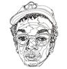
Negative IllustrationTitle: "Reflection" (Part 2 of 2 Illustrations)
Size: 25.3cm x 38cm Medium: Colored Pencil and Watercolors on Illustration Board Completion: 12/1/2020 Exhibition Text: In this second piece of the two-part illustration project, the mood that is shown is quite the opposite of the first illustration, depicting a both frightened and in some way distraught man surrounded by a background of chaos. While the first part of this series represented the way one projects themselves to the outer world - in a positive light - this piece represents one's inner most struggles; in this case, it is a man that is trying to find his true self, and not the version that the people around him may prefer.
|

|
Inspiration
Jenny Saville

Study for Isis and Horus. Saville, 2011.
|
Jenny Saville is a modern British painter who is often credited with reinventing expressionist and surrealist female nudes for the complexities that contemporary art can often lack. Her work is often created with collages; different bodies and sketches and colors meld together to create one fantastical piece, usually giving off a less positive mood. Her works can be rather confusing and hard to digest, and they often include duller and darker colors, giving little vibrancy, but focusing more on technique, tone, and contrast. Although, while the contrast is relatively high on a technical level, each portion of her pieces tend to blend together due to the little amount of outlining and small variety of color use.
|
|
After studying at several different schools in the UK, as well as attending art school in the US, Saville's career quickly took off due to a generous contract that supported her while she worked on new pieces. Saville is a large proponent of feminist studies, and a lot of her work is based upon the gender bias that she saw in the art world growing up. Her biggest claim to fame, especially as a women, was selling a piece for 12 million US dollars, the highest price for a painting created by a women.
|

Pastel Bodies. Saville, 2014.
|
Critical Investigation

Dusk. Saville, 2014.
|
The composition and mood of this piece is utterly untouchable. Saville creates a portrait with extremely realistic geometry, proportions, and dimensions, while surrounding it with dark streaks of dull and low-opacity colors in order to create a melancholic and eerie mood. The technique used within the portrait itself is rather fascinating; Saville's strokes of skin tone colored pencils seem very sporadic and chaotic, yet the shape that they take seems intentional and gives the face more movement, especially in the bridge of the nose and the cheeks. The movement is primarily sharp, and the streaks are layered. It's able to be seen that the coloring is not light, the pencil is being pressed firmly onto the page. The shading is extremely realistic, with darker reds being shown on the shadows that the nose projects around the upper lip and over the eye. The eyes themselves show little life, which only adds to the more negative tone of the piece. There is water color tapped and brushed around the piece that covers parts of the face, and it can also be seen that colored pencil is chaotically scribbled to layer over some of these painted areas. The realism of the proportions and shading combined with the surrealist technique and surroundings of this piece creates a beautiful, somewhat abstract portrait with a darker tone.
|
Planning
Reference Photos
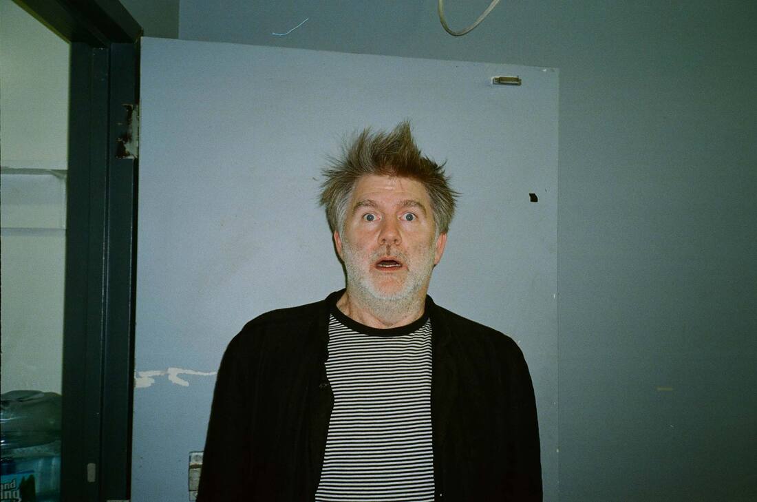
James Murphy, photo by Alexander Cody Nguyen
|
For this piece, it is going to include multiple different faces that come together as one, each expressing somewhat different emotions. This first photo was taken by Alexander Cody Nguyen for Document Magazine, and features James Murphy with a surprised, almost scared look on his face. This expression is perfect for my piece. Nguyen is a film photographer based in NYC whose work is filled with personal, street, and commission-based photography. He has a sizeable Instagram following, and is hired by magazines and newspapers quite frequently.
|
|
This second photo was chosen for the rather obscure posture from Murphy, as well as the facial expression. The angle at which his head was facing was also something I was looking for, as I wanted one of the faces looking straight on, while the remaining face is looking either left or right. This face will featured on the left side of my piece, and will represent much more strong emotion compared to that of my first reference. This photo was taken by David Brendan Hall for Consequence of Sound, and features Murphy performing with his band, LCD Soundsystem. Hall is a freelance photographer who specializes in live music and events, getting his work frequently bought out by magazines and journalists around the US.
|
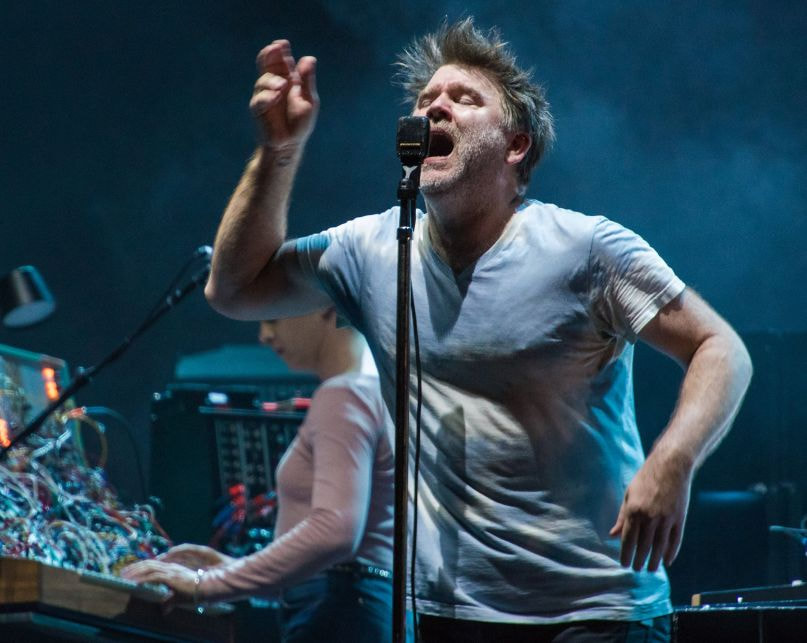
LCD Soundsystem, David Brendan Hall, 2018.
|
Sketches

|
In this page of my sketchbook, I cover the overall composition and form of the piece, and how the reference photos will meld into one. I also discuss the meaning behind naming this piece "Reflection":
"Whereas the first piece is titled 'Projection' to represent the outward expressions of the subject, 'Reflection' refers to their inner struggle that the outside world does not know about." |

|
On this part of my sketchbook, I go over the rough amount of colors I will be using, and why, based on the faces themselves and the background:
"Faces: Duller skin tones, far less saturated, less surreal colors and more realistic as far as colors (not realistic as far as composition). "Background: Ideas taken directly from critical investigation of Jenny Saville; Abstract streaks of black, pink, yellow, and blue watercolors, very low opacity brushstrokes (slightly more water than paint)." |
Process

|
To start, I simply copied the look of my original sketch, making tiny adjustments to create the composition and angles that I wanted. The linework shown is not necessarily all the sketching that I used for the coloring process. As I was coloring, there were smaller details that I drew in so that I could maintain some continuity with the facial proportions.
|
|
The process for coloring the skin was the most difficult part of the creation of this piece. In this particular photo I was starting by experimenting with my technique. The method shown was simply coloring in a continuous motion, with staggered pressure based on where there were shadows and blemishes in the skin. I made darker marks and lines with a slightly deeper shade of peach. The next method that I decided on was to color extremely lightly with the primary skin color, and following this up with layers of more colors depending upon the lighting in a given portion of the face.
|

|

|
This photo was taken directly after I had finished coloring both faces. I used the second method described above for all of the natural skin colors, then creating more layers of several shades of gray for the beard, making tiny individual strands for darker patches, and simply hatching with a lighter gray for the areas of the beard with more highlights. I then used lavender and teal pencils to create some abstract linework and shadows, which is representative of my inspiration done by Jenny Saville.
|
|
I decided to make the borders on this piece black, as the borders on the previous pieces were a very bright red. It was important to me that they have lots of contrast from the subject of the piece, but this one needed something darker, as it's supposed to have a much more negative mood.
After coloring the borders, I then finished the shirt with two different tints of blue and a shade of dark purple, using different hatching and sectional coloring methods. I did the same for the jacket with varying levels of pressure with the black colored pencil. |

|
Experimentation

|

|
The background is the part of the piece where the most experimentation took place. I used watercolors as to best capture Jenny Saville's techniques, though I had to be careful about these watercolors overtaking my primary medium of colored pencils. I used the chart on the left as a basic guide for the range of colors I'd be using in the background. I started by using the color at the bottom: a low opacity layer of a dull pink. After this, I looked closer at the background of Dusk by Saville:
I mimicked some of Saville's brush strokes and colors as best I could in order to maintain my connection to this artist. For example, the teal surrounding the eyes, the yellow spot on the right temple, and the purple streak passing through the forehead and the hair all show up in my piece. The blacks were mixed with a lot of water for two reasons; firstly, the opacity had to be low so that the colors on the face could be seen even with a layer of paint over them. The other reason was so that the paint could be applied without the brush even touching the illustration board, and the paint/water mixture would still spread. I also indulged in the technique of holding the brush above the board and tapping the brush with my other hand to have small drops of paint covering the page...
Compare and Contrast

Similarities- The more abstract layers of colored pencil over the skin are very similar. There are stagnant lines of lavender, pink, black, and different skin tones that are layered over the more flat and realistic layers of color.
- The mood of the pieces are very similar, with subjects that are in some kind of surreal state. In Saville's piece, it is a head, with no body, surrounded by an abstract background. In my own piece, the subject does have a body, but they have two faces stretching off of one another. - The backgrounds in both pieces are extremely similar. The low opacity layer of bright pink as the first layer is apparent in both pieces, as well as the relatively subtle appearances of teal, lavender and yellow, all of which are on similar locations on both pieces. The blotches of black use similar methods, some portions being streaks and thin brushstrokes, and other portions being flicked onto the illustration board off of the brush. |

Differences- While the overall mood that is being conveyed in both pieces is very similar, the overall composition of the subjects is rather different. The most obvious difference here is the faces. On my own piece, there are two faces being shown, and in Saville's, there is only one. And while both pieces include some surrealist touches, the context behind the surrealism in the composition is different, with Saville's piece having a subject with no body being shown, and my piece including a body.
- It is clear that Jenny Saville's Dusk has more 3-dimensional qualities and geometry. The shading combined with all of the highlights in the face give the head a lot more realism than that of my work. - Saville's piece is darker over all, with both less quantity of colors and less vibrancy within those colors. The color is solid and shows very little white below the colored layers, though the colors themselves are very dull. |
Reflection
|
|
This piece was extremely fun to make, with lots of variety in technique, color, and some experimentation with mediums. I'm very proud of the ways in which this piece can be perceived. On it's own, it's a well-composed and fascinating piece to look at, though it speaks higher volumes conceptually, especially when showcased with it's partner in this two-part illustration series. The first piece foreshadows, in a way, the conflict that our subject is experiencing, though this piece shows it more outright, and in a far more unnerving and surreal way. Jenny Saville's ominous and melancholy style was a perfect choice for the negative side of the illustration series, showing an abstractly put together subject that is ultimately composed in a realistic form, though is surrounded by surreal conditions, creating a mood that is hard to touch on using other styles. I feel as though I captured these methods and ways of depicting a negative mood rather well in my piece, "Reflection". The more realistic shading of the faces and variety in color usage for the skin tones is very similar to Saville's work, and the abstract painted background brings this concept all together.
|
ACT Responses
1) Clearly explain and describe how you are able to identify the cause-effect relationships between your inspiration and its effect upon your artwork.
Throughout the process of creating this piece, every time I looked back at my inspiration's work, I was constantly shifting the techniques I was using for coloring the skin. Once I would notice a new detail in Saville's method of creating realistic skin and shading, I would modify the way I was coloring to more accurately portray her work. For this reason, there ended up being lots variety in my coloring techniques.
2) What is the overall approach (point of view) the author (from your research) has regarding the topic of your inspiration?
Jenny Saville is well respected as an artist, but also as a very active and prominent feminist in the art world. She ties the concepts and subjects in her work to a feminist approach, going against a lot of cultural norms that have been propped up in a subtly misogynistic way.
3) What kind of generalizations and conclusions have you discovered about people, ideas, cultures, etc. while you researched your inspiration?
Throughout the research phase of this project, I was able to conclude that a lot of feminist-related art has been infiltrated by a staggering amount of male artists, creating an ironic farce of feminist connections to art. Oftentimes the more clear and meaningful artistic concepts that are created by women themselves have the more concise connections to feminist ideals.
4) What was the central idea or theme around your inspirational research?
The primary theme that I was looking for more ominous and negative-toned pieces that used techniques that could be relatively easily translated to my own primary medium of colored pencil. I was also looking for something with a little more surreal composition to find a way to create some unnerving contrast between my two illustrations in the positive/negative illustration series.
5) What kind of inferences (conclusions reached on the basis of evidence and reasoning) did you make while reading your research?
I was able to infer that for an extremely long time, even relative to the entire known history of art, the dynamics of gender hadn't been explored very thoroughly. Not even specifically in reference to the artworks, but also in reference to the artist themselves. The way business worked in art was very patriarchal, despite much of fine art having glorified the female body.
