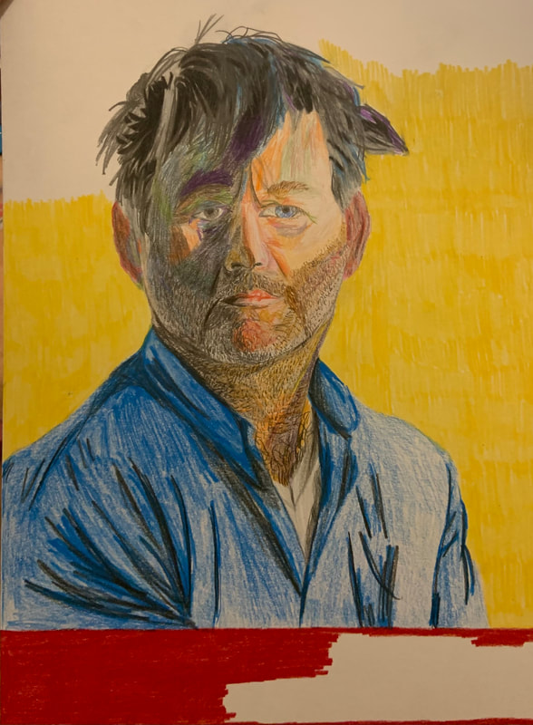
Positive IllustrationTitle: "Projection" (Part 1 of 2 Illustrations)
Size: 25.3cm x 38cm Medium: Colored Pencils on Illustration Board Completion: 12/1/2020 Exhibition Text: In this first piece of the two-part illustration project, the mood that is shown is primarily indifference, though the dark shadows on one half of the face suggest a slightly darker tone, perhaps internally. The goal of this piece was to establish just that, with the title, "Projection", referring to the outer shell of faux positive emotion that is being used to cover up the inner struggle that the second part of this series shows.
|

|
Inspiration
Artist #1 of 2: Lucian Freud

Bella, 1981
|
As the grandson of Sigmund Freud, Lucian Freud had a rather ambitious family name to live up to, and he only exceeded expectations by becoming one of the most influential portraitists of the entire 20th century. His early work consisted of primarily full body nudes, most of which were slightly disproportionate, and blended to the point of not being able to see any brush strokes what so ever. The pieces were well composed, yet drab and gray, exuding a rather moody feel to his work. His later pieces gained the most traction and showed how much his style had changed (these kinds of pieces are my favorites). While his proportions and facial anatomy became spot-on, his brushwork became more bare-bones and each streak was far more prominent, allowing him to play with color more than his earlier work would allow for.
|
|
Freud's artistic career followed after his early life struggles, with him having to flee his home in Germany when he was a teenager in order to escape from the Nazi Regime. From then on, he was based in London, receiving higher education at both the Central School of Art and Cedric Morris' East Anglian School of Painting and Drawing. Before the war with the Nazis ended, he fought in the Navy during World War II before being invalided. He began receiving commissions after this, usually depicting surreal German Expressionism and the previously mentioned moody portraits. By the 90s, he had become world renowned and had works selling for tens millions of dollars at prestigious galleries in both New York and London.
|

|
Artist #2 of 2: Tai-Shan Schierenberg

Mother, 2006
|
Tai-Shan Schierenberg is a contemporary Chinese-German painter based in London. He's been commissioned to paint the Royal Couple, John Mortimer, Lords Carrington and Sainsbury, and Seamus Heaney. His style is similar to that of Lucian Freud, with brush strokes that experiment with color and texture, all of which create a larger, very lifelike portrait with fascinating usages of movement, shadows, and vibrancy. After decades of gaining fame around the globe, Schierenberg is now the Head of Painting at The Art Academy in London at the age of 58.
|
|
Schierenberg grew up to a young Chinese mother and German father who was a painter. As a very young child, he grew up in Malaysia with his grandparents, but later moved back to London with his parents. As he grew older and into his teens, he was exposed to many art galleries throughout England, becoming heavily influenced by his father and his favorite artists. Little is known about Schierenberg's background because of his still relatively young age, though his work is extremely highly regarded around the world, especially in museums and galleries in the UK.
|

|
Critical Investigation

Head of the Big Man by Lucian Freud, 1975.
|
Head of the Big Man is one of Freud's lesser-known works, though it incapsulates his style extremely well. As mentioned above, the brushwork is simplistic and the colors are vibrant; although this piece includes lots of contrast throughout the contour of the man's face, with spots of orange and red to give blush to places like the cheeks, the ears, and the chin. The piece would at first appear to be rather mood-less, with an emotionless face of an average-looking man, though this is deceiving. There is an immense amount of texture being portrayed here, with each streak of oil paint moving in a different direction. While there is a rather small amount of actual shading being shown in this portrait, the movement of each stroke is what implies the 3-dimensional look that the piece has. And while the movement is crucial to the sharp geometry and realistic proportions, the color is equally as incremental to the dimensions of the face. In places where there is bless blending, such as the chin, ears, and forehead, there are clearly different sections of the face that are portioned off using only movement and color. For example, the round, red chin contrasts heavily from the rest of the jaw, with completely different tones of skin color being used in such a consolidated area. Speaking of consildation, this piece is far smaller than one would think, allowing for such detail to be represented in such a small sizing ratio compared to that of a portrait being painted on a larger canvas, with far more brushstrokes being needed. These same kinds of techniques can be achieved using colored pencil, though it will still be a challenge to capture this look that Freud portrays.
|
|
Schierenberg's Blue Balthasar is a recent piece of his, depicting a young man whose face is created using a large number of both warm and cool colors, dependent upon the way in which the light is hitting his face. This piece is more focused on both color and shading, with even more simplistic brush strokes than Freud's piece above, though this portrait is far larger. The technique with the brushwork is more representational of a style like that of Matisse. The colors, while less realistic, still convey a very realistic portrait with lots of movement and realistic geometry and facial anatomy. On the man's forehead is a sort of scale with which Schierenberg creates shadows. The deepest blues are at the very top of the scalp, representing the darkest points of the head. As the strokes move forward along the scalp and reach the forehead, we see lighter violets and lavenders, with tinges of olive green and baby blue. This begins to sharply blend into dark reds, bright oranges, and different shades of brown around the nose and cheeks. The same dark blues are shown around the lips and nose to again depict darker shadows on the man's face. All of these different colors are separate strokes, and little effort is made to fully blend any of them together. While each color and streak of paint is separate, all of this very angular geometry creates a coherent and realistic face, like that of a puzzle. This theme is prevalent in both of my inspirations.
|

|
Planning
Reference Photo

Mr. Murphy in the wine bar. Photo by Alex Welsh for the New York Times.
|
When I had begun even thinking about what I was going to create for this positive illustration portion of our two-part project, I knew exactly what I wanted to be as the subject. James Murphy is someone that I've drawn a lot in the past in many different styles for several reasons. To start, he's been my favorite music artist for around 2 years as the frontman of LCD Soundsystem and the mastermind behind the indie dance label, DFA Records. He also has some very interesting facial features that I enjoy portraying in different ways, such as his asymmetrical eye shapes, his long and narrow philtrum, and his creases protruding out of the inside edge of his brows, as if they are constantly furrowed. His hair is also something that's difficult to illustrate, with it's many sharp strands and angular edges. This specific photo is one that I stumbled across while researching for a good reference, and I instantly fell in love with the start contrast and perfect lighting. There's lots of areas to play with as far as experimentation with color and lighting scales. As a photographer myself, my favorite element to utilize is contrast and striking differences between deep, dark shadows, and slightly overexposed highlights. I knew that these elements of color lighting, and contrast would all work well with my artists of inspiration, so I knew I could capture the movement and experimentation with color that I wanted to capture for this project. This particular photo appeared in The New York Times on May 12th, 2015 in an article about Murphy's new wine bar, written by Jeff Gordinier with photos by Alex Welsh.
|
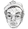
Sketches

|
On this first sketch, I layed out what exactly it was I wanted to do with my reference photo, going over the three broad steps that would likely unfold over the course of the piece's creation. The first step was going to be to create a grid in order to copy the correct proportions of my subject's face. However, I didn't know yet if this grid would actually be utilized or not, as I also wanted my proportions to be more natural and seem a little less artificial. I knew that my second step would be to start with my lightest portions of the face, as well as the darkest. I've learned in the past with painting and illustrating that it's best to start with the most extreme colors/shades of light, and then work over the more neutral area on the scale that one is working with. The darkest areas would have deep cooler colors, while the highlights would have bright warm colors mixed with the standard skin tones. The shirt step would be to fill in the remaining portions of the face, which would include the more realistic skin tones. This process is very similar to that of Blue Balthasar by Schierenberg, though the colors themselves would be heavily based upon Freud's piece. Below these steps, I included almost all of the basic colors I would be using; all of them being showcased in a skin tone scale, from darkest on the left, to lightest on the right.
|
|
This sketch is a basic outline of the reference photo shown above, with minor facial details. It was drawn freehand in order to see how well I could get the proportions of both the outer linework and the facial anatomy. I then used this sketch to go over what colors would be used on the portrait and where.
|

|

|

|
My final sketch shows an outline of the reference photo using a size 01 micron ink. I used pencil to portion out the general areas in which different colors would be used. These divisions are based upon shadows, highlights, hair, lips, blushes, standard skin tones, and facial hair. While I've discussed already how I was going to create the skin tones, and my reasoning for using non-realistic colors in certain places (based upon the surrealist color use by Schierenberg and the vibrancy of reds and blushes from Freud), I had not yet decided upon how I was coloring the hair of James Murphy. For this, I wanted a blend of both realistic and surreal color, so I closely analyzed the different ways in which light reflected off the strands of hair. Most of the hair is in the dark, with blacks and dark grays being used, though there are a couple spots on the right side of the photo where reflections of blue can be seen, and there are several strands that could be represented using olive green. With my colors decided upon and my proportions laid out, I was ready to dive into the process of blending this particular portrait with the techniques of Frued and Schierenberg.
Process and Experimentation

|
At the start of the final project, I began by resizing the original sketch of the portrait, and tracing it on the provided illustration board to the best of my ability. My goal was to get the basic outline as exact as possible, as well as most of the facial features, but with very minimal detail, as I would be covering it up with my primary medium of colored pencil. After I created the sketch that is shown, I lightly went over the entire thing with an eraser in order to get the lightest lines possible so that none of the original sketch would show through in the final product.
|
|
In between the coloring of the different portions of the face, I worked on the shirt and the background in order to keep my mind busy and not hyper-focus on too many unnecessary details. This is my usual work ethic, as it helps me bring my attention away from certain areas, so that when I come back to them, I have a relatively refreshed mindset and notice different areas that require attention that I may not have if I just continued working in the same place for a long amount of time. In this particular stance, that seemed to help me with the extreme contrast of lighting in this piece. The proportions and general composition began to render similarities to that of Head of the Big Man by Freud, and my stark differences in surrealist colors, especially the blues and greens seen on the left half of the face were taken from Schierenberg's work.
|

|
|
By this point I had finished the details in the hair and face, and fully finished the shirt. The shirt was three layers of colors, using two different blues in different levels of opacity. The lighting scale can essentially be seen from left to right, with darkest on the left and lightest on the right. The third layer was black for the folds and details in the clothing. I had noticed that in Freud's piece, the detail in the clothing was very minimal, so this is what I decided to go for in my own work as a contrast to the intense detail within the face.
On a separate note, the hair was a rather interesting portion of the piece to mimic. The intense darkness in certain portions of the original reference photo allowed for me to make quick work of large portions of the hair. I was able to outline the absolute darkest portions of the hair, places where light wasn't even reaching, and I colored these areas black. I think went over these layers with two different shades of gray, using lines for different strands of hair, doing my best to show the movement of different sections of the hair. There were certain strands on the right side of the head that seemed to be hit by the light in a way that allowed for some interesting colors to appear, and I represented these strands with blues and purples mixed with lighter grays. |
Compare and Contrast

|

|
|
Similarities- The overall composition and mood is extremely similar to that of Head of the Big Man by Freud. The expression on the men's' faces is very monotone, and the way that the colors are sectioned out across the face is also very similar.
- The colors themselves are very similar the colors in Freud's work. The oranges as the blemishes and blushes are both very saturated, and the high contrast with the deep reds is taken directly from the painting by Freud. - The surreal and exaggerated color is taken from Blue Balthasar by Schierenberg. In the lower lit areas of the face in Schierenberg's piece, there are different shades of blue and olive green that can be seen mixed in with shades of the skin tone, which is reflected in my work. |
Differences- The saturation of the skin tones in the face is far different from both of my inspirations, with my intention being to have very highly contrasting, yet separate, shades of orange making up most of the face.
- My movement of color and proportions are extremely different from the realistic compositions within Freud's and Schierenberg's portraits. My technique was slightly off, with the intention here being to have many small portions of color making up the look of the entire portrait, though my sections of color became larger than intended. - The dimensions and realistic roundness of the face was slightly lost in the coloring process in my final product, while Frued and Schirenberg's works show a clearly realistic, roundness to the head and reflect a little more concise shape than my work. |
Reflection
|
|
The anticipation and process of creating this piece was some of the most fun I've had with these kinds of mediums in a long time. I enjoyed applying the techniques of some of my favorite visual artists to a portrait of one of my favorite musical figures quite a bit, and I found the entire concept of this positive/negative project to be rather enjoyable. The final outcome, though slightly different on a technical level than I had originally anticipated, turned out to be extremely pleasing to the eye, with a blend of relatively realistic proportions and lighting with surrealist colors and coloring techniques. The portrait is well composed, though it includes intentionally ill-proportioned eyes as a nod to the subject in Freud's piece having slightly asymmetrical eyes. The focus for this piece was on color, primarily because of the indifferent and monotone facial expression needing some contrast with vibrant colors in order to convey the mood that I had wanted; someone who expresses the aforementioned indifference, though carries deeper emotional weight, which is expanded on in the second piece of this two-part series.
|
ACT Responses
1) Clearly explain and describe how you are able to identify the cause-effect relationships between your inspiration and its effect upon your artwork.
Throughout the coloring process, I was constantly comparing my sectional technique to that of Lucian Freud's and Tai-Shan Schierenberg's. They both used a step-by-step approach to color and lighting, allowing tiny portions of the face to be comprised of different colors, which is the motion that I conveyed in my final product.
2) What is the overall approach (point of view) the author (from your research) has regarding the topic of your inspiration?
Freud's work is examined very critically by many different fans and journalists alike, closely analyzing his unique and relatively new techniques with brushwork. The way his impressionist take on brushwork created extremely captivating facial compositions was a fascinating concept, especially for the time, and this technique is still idolized today.
3) What kind of generalizations and conclusions have you discovered about people, ideas, cultures, etc. while you researched your inspiration?
I found that unique art and new techniques are discovered primarily from inspiration and the compilations of different, already well-established styles. Freud and Schierenberg's backgrounds are very similar in that they grew up surrounded by art, being exposed to all sorts of different works, allowing for them to form their own styles out of everything they knew.
4) What was the central idea or theme around your inspirational research?
The primary subject of my research was in the technique. I already knew that Lucian Freud was someone who I wanted to base a piece on, and I looked more into his sectional technique in which he uses small sections of color to create a larger picture. I always find pieces like this to be very captivating, and researching this topic is how I came across Schierenberg.
5) What kind of inferences (conclusions reached on the basis of evidence and reasoning) did you make while reading your research?
I realized that a deterrence from an exact mimic of my inspiration is a very complicated concept; while the point of the project is to mimic this inspiration, the personal and artistic backgrounds of both of my artists of inspiration indicate that creation of a unique style is found from inspiration, and the creation of a piece using the techniques of both of these artists that includes twists of my own doing is a sign of the development of my own style.
